
MY ROLE
In the capacity of Lead UX Designer, my role encompassed multifaceted responsibilities integral to project success:
1. Team Leadership and Guidance: Provided mentorship and guidance to a team of designers, fostering their professional development and aiding them in their tasks.
2. Strategic Design Planning: Formulated and executed the strategic product design approach, defining the pathway for achieving project milestones and goals.
3. User Research Oversight: Led and interpreted user research efforts, ensuring a comprehensive understanding of user needs, behaviours, and preferences.
4. UX Design for Running Section: Spearheaded the UX design initiative for the Running section within the app, focusing on enhancing user experience and engagement.
5. UI Style Guide Development: Developed and curated the foundational elements and guidelines for UI design, establishing a cohesive and consistent visual language for the project.
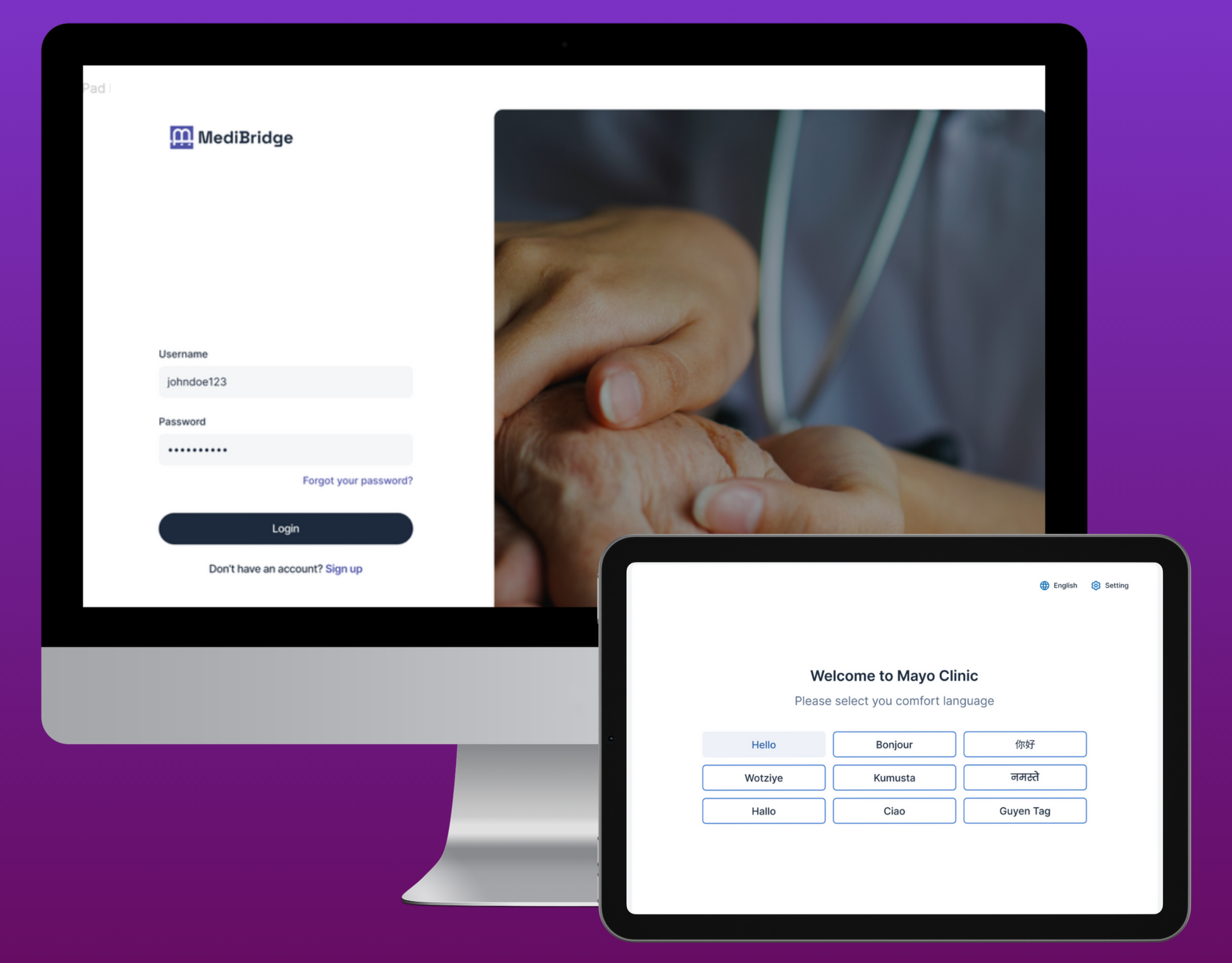
PROJECT OVERVIEW


DESIGN strategy
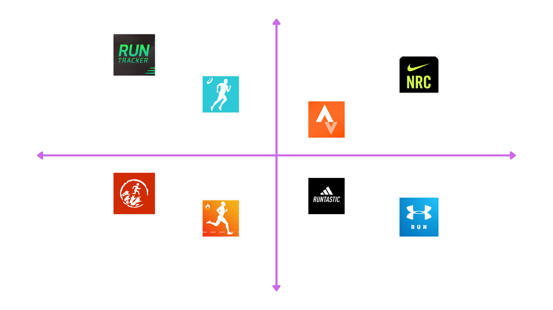
COMPETITOR ANALYSIS
SUMMARY
In summary, all four applications share core functionalities like run tracking, mapping, and analysis. Yet, each app boasts distinct features setting them apart. Nike Running Club prioritizes personalization, Runtastic includes an in-app music player, while Runkeeper integrates seamlessly with wearables and smartwatches, offering unique advantages to users.
USER RESEARCH
During the user research phase, a comprehensive approach was adopted, encompassing both qualitative and quantitative methodologies.
Qualitative Methods:
Interviews and Observations: Engaged current and past app users through interviews and observed their interactions with the app. These methods aimed to unearth underlying pain points and frustrations experienced by users.
Quantitative Methods:
Surveys: Distributed surveys to a sizable user base, querying their satisfaction levels, demographics, and running habits. This large-scale approach provided a broad understanding of user sentiments.
Analytics Data: Leveraged analytics data to delve into user behavior within the app. This data unveiled patterns of interaction, highlighting feature usage metrics and identifying areas of high and low engagement.

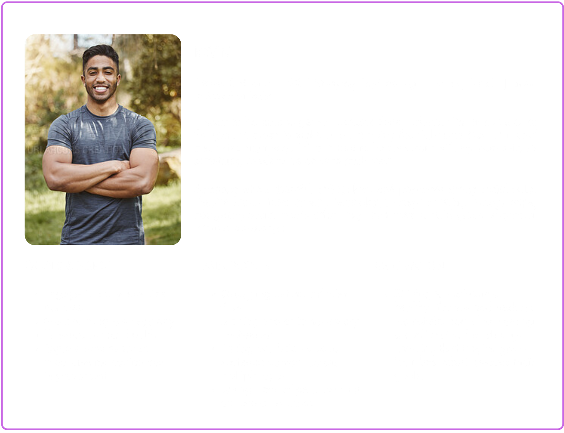
PERSONA
From the insights gathered through user research, our team crafted multiple personas embodying various user types of the application. These personas were created to encapsulate the diverse range of individuals engaging with the app.
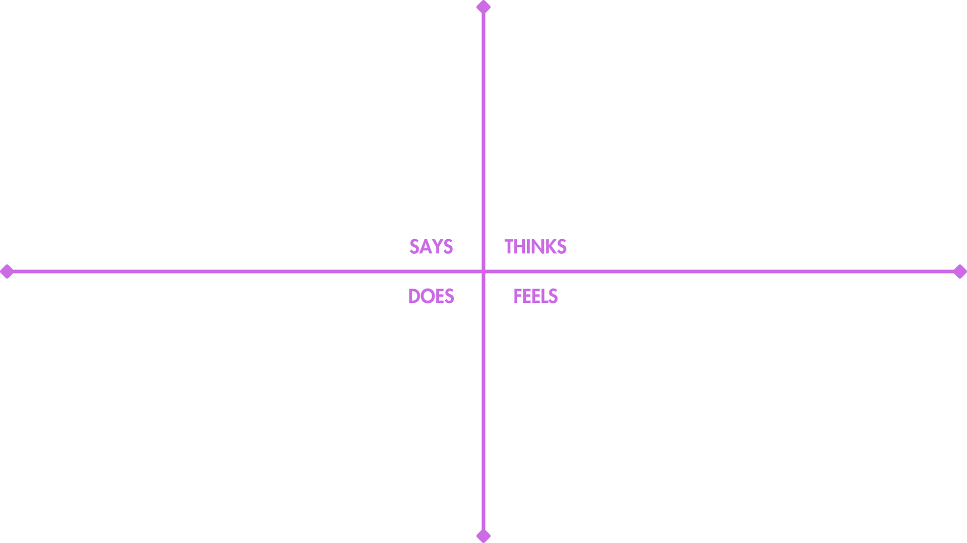
EMPATHY MAP
The team extended their comprehension of user experiences by crafting empathy maps for each persona. These maps provided insights into the thoughts, emotions, and behaviors of users at various stages of their journey, aiding in a deeper understanding of their perspectives.
IDEATION & SKETCHING
With a profound grasp of user needs, the team orchestrated a redesign of the app, implementing several crucial changes:
1. Simplification of the onboarding process for a smoother user initiation.
2. Integration of personalized feedback and encouragement to enhance user engagement.
3. Streamlining goal setting and tracking functionalities for user convenience.
4. Enhancing the app's performance and reliability, ensuring a smoother user experience.
2. Integration of personalized feedback and encouragement to enhance user engagement.
3. Streamlining goal setting and tracking functionalities for user convenience.
4. Enhancing the app's performance and reliability, ensuring a smoother user experience.


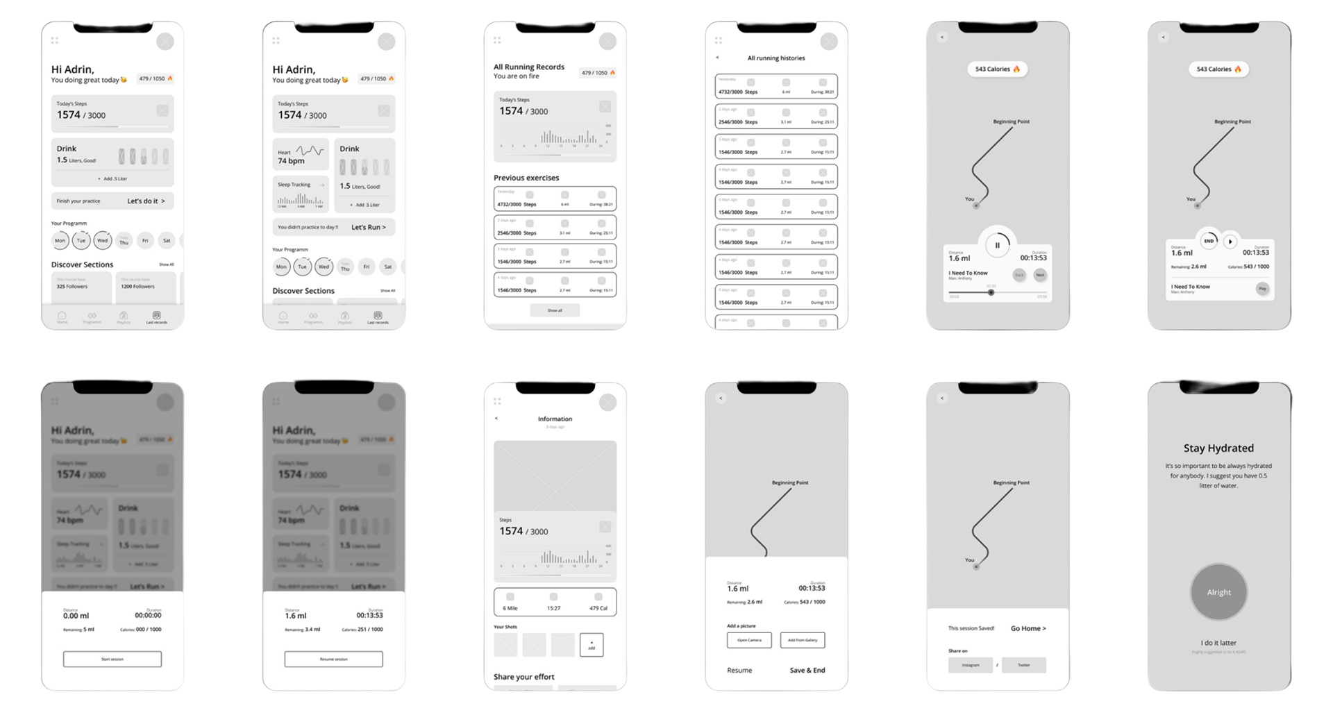
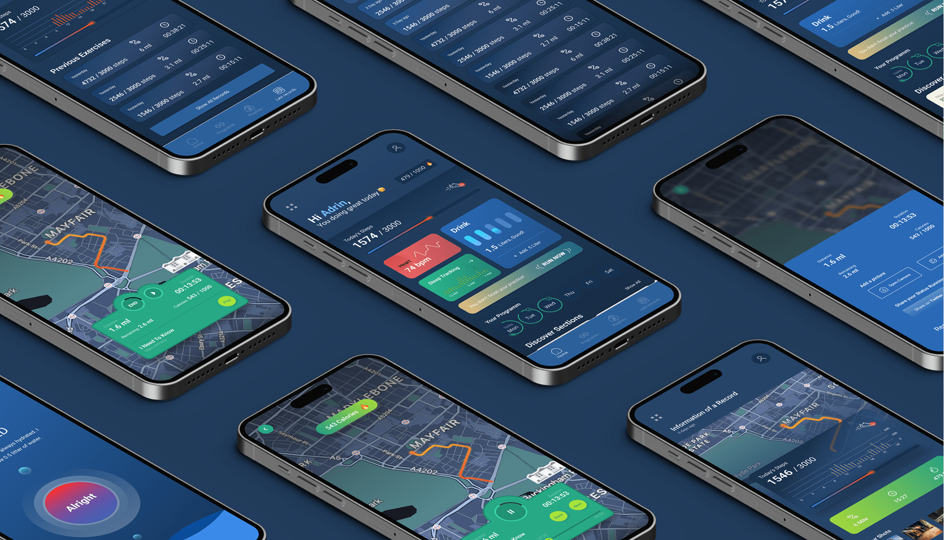
WIREFRAMES
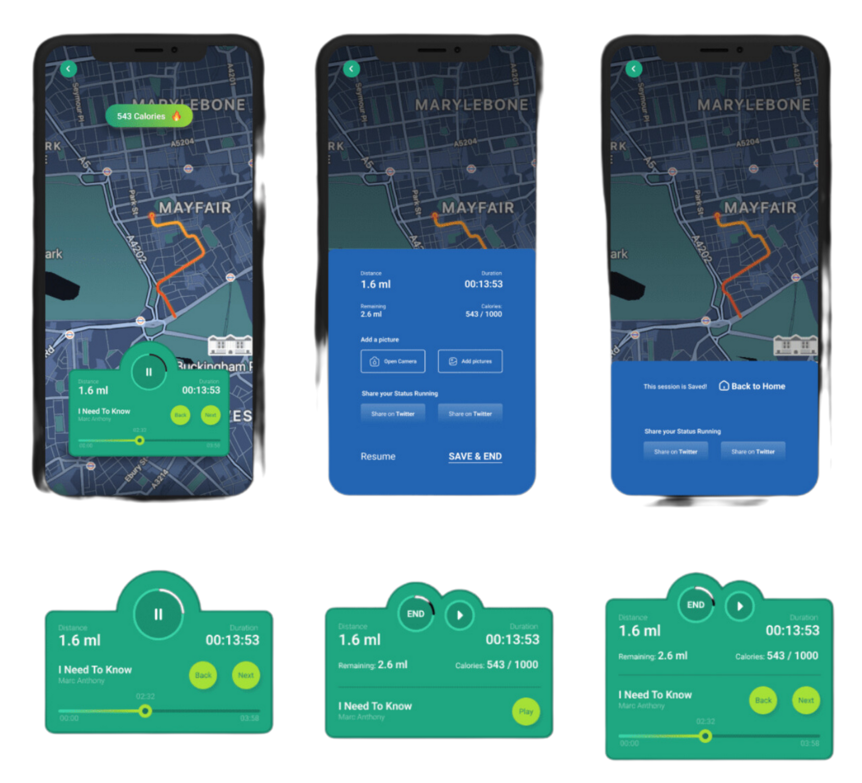
PROTOTYPE
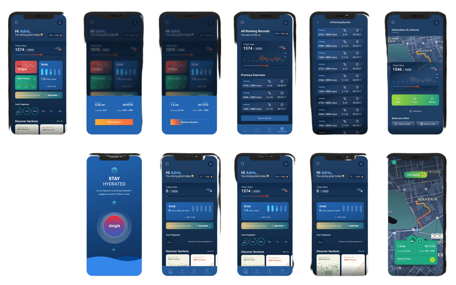
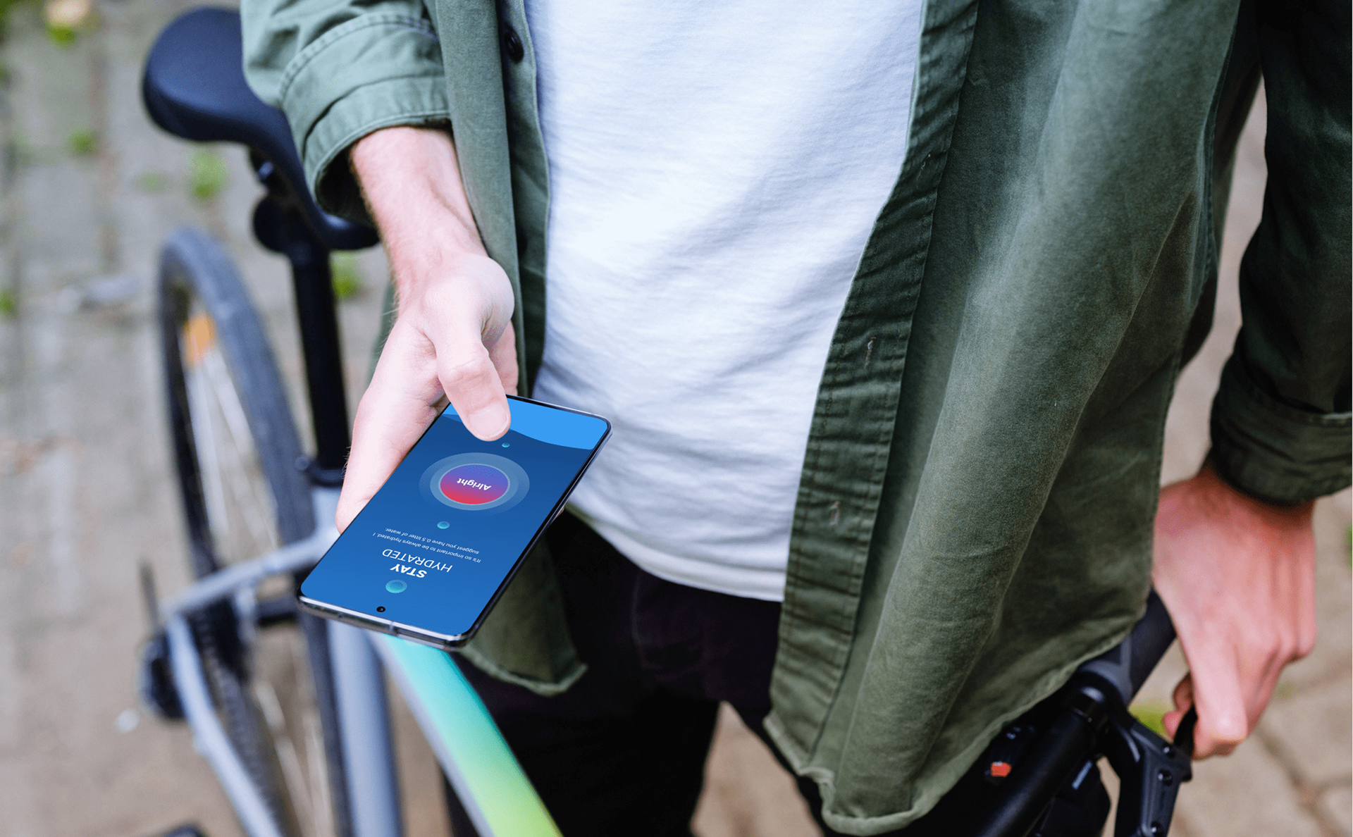
Prioritizing precise language and messaging for user-friendly applications. Example: Post a 4-mile run, using "Back to Home" instead of "Exit" on the session-saving page.
Micro empathy in UX writing: Encourages rest by associating "home" with relaxation. Subtle cue: Directs users to the app's home page, creating a comforting connection.
Detailed interactions and motions are emphasized throughout the project for enhanced user experience.
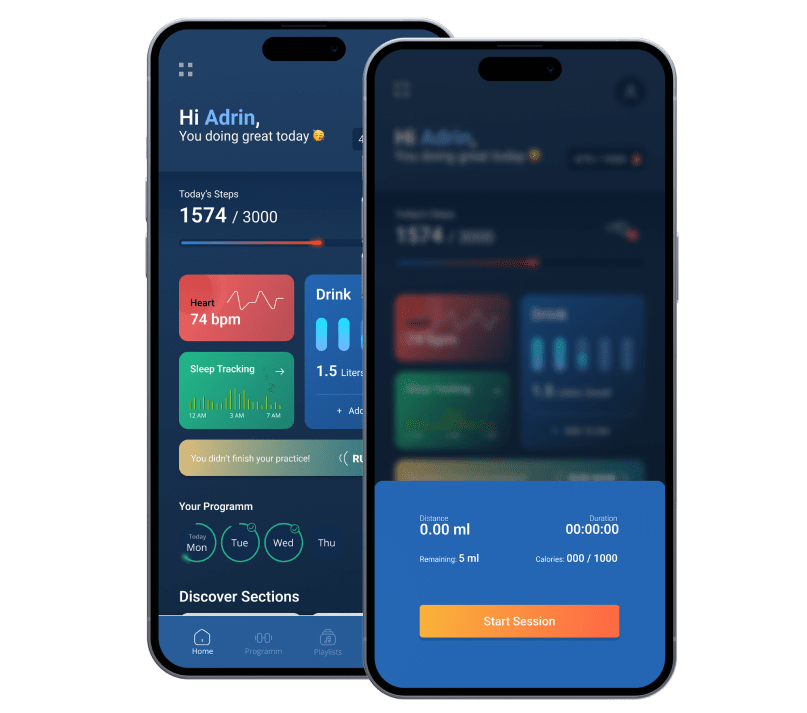
Tracking Your Progress:
By streamlining the initial steps when users start using the app, we reduce any confusion or hurdles they might face. Clear instructions and a straightforward setup process enable users to get started quickly, focusing more on their running plans and goals.
Calories Burned:
The app provides detailed insights into the calories burnt during running sessions or daily walks. This information helps users gauge their workout intensity and overall progress, aligning with fitness objectives and dietary plans.
Music Integration:
Users can curate personalized playlists within the app, creating an enjoyable and motivating soundtrack for their exercise routines. The flexibility to select preferred music enhances the overall workout experience, making sessions more engaging and enjoyable.
INTERACTION DESIGN
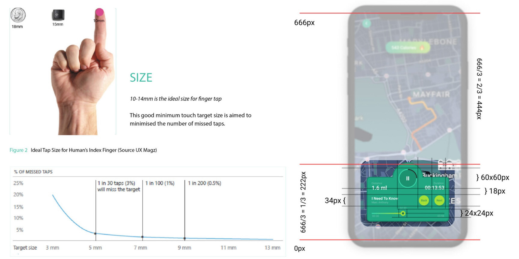
Research indicates that many individuals struggle with accurately touching points smaller than 3mm (11.33px) on screens, often missing the intended action. Through calculations, we've determined that a minimum size of 5mm (18.89px) is necessary to ensure users don't miss their taps.
Our Resolution:
- Our smallest button maintains a size of at least 6.5mm (24px), well exceeding the recommended size. This ensures ease of use and minimizes missed actions.
- For critical functions like the pause button, we've enlarged it significantly to 16mm (60px). This substantial size guarantees that users, even while engaged in activities like running, can effortlessly tap the button with precision, reducing the chances of missed interactions.
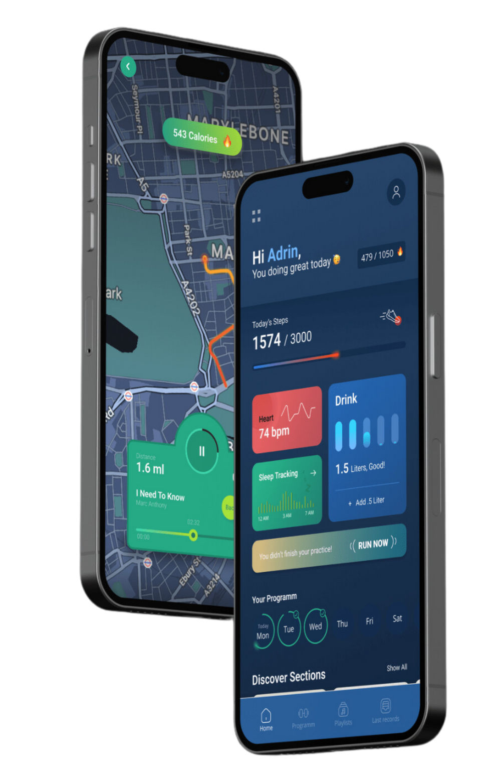
VISUAL DESIGN
Initially, our app design leaned towards minimalism with fewer colors. However, user feedback highlighted their comfort with more vibrant, colorful interfaces in training and exercise apps. Colors present an opportunity to emotionally connect with users and enhance their experience.
We've incorporated color theories into our design strategy. By utilizing a varied palette, we aim to communicate effectively with users. For instance, the combination of orange and red conveys energy, igniting a sense of vitality in users. On the other hand, using blue and green invokes a calming and peaceful sensation, especially during intense running sessions, offering a moment of tranquillity amidst effort.
Our new design approach aims to boost user morale by introducing vibrant and bright colors. This visual enhancement intends to evoke specific emotions aligned with users' needs during their workout sessions.

CONCLUSION
The app's successful redesign led to a substantial drop in churn rate and a boost in user satisfaction. Insights from user research, personas, pain points, and positive aspects played a crucial role in comprehending users' needs, and refining the app's experience for casual runners. The result is a more tailored and delightful user journey, aligning closely with the target audience's preferences. The feedback from users has been overwhelmingly positive, validating the improvements made.